Optimizing Canva Designs for Mobile Phones
Canvify and Canva do a great job of magically resizing your pages to fit the screen of any device.
However, sometimes magic isn’t enough, or you may want things to look different. Follow along!
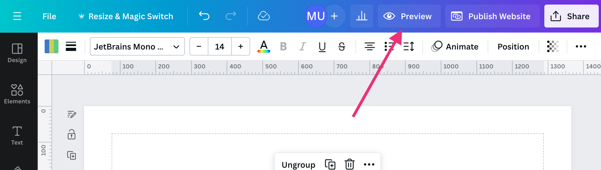
1. Use Mobile Preview in Canva
Click Preview and select Mobile to see how your design looks on a mobile device. Your Canvify page will look exactly as it appears in the Canva preview.
2. Use Canvify’s Website Templates
We suggest you use a template from the ones we provide. They are designed to look great on any device. Canva also has a great selection of templates. Starting with one and removing elements that you don’t need is a great way to ensure your design follows best practices from the outset.
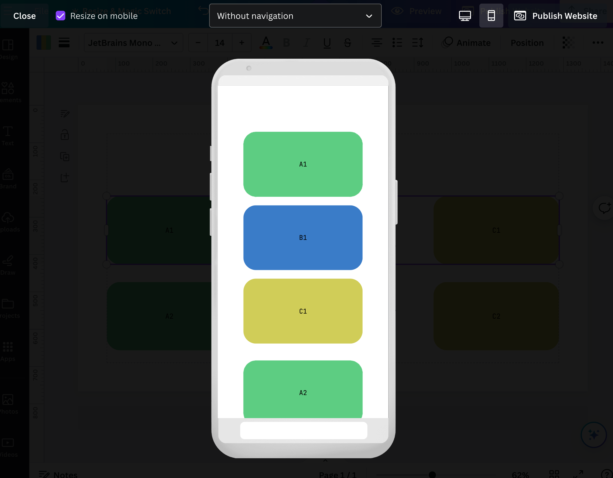
3. Group and Ungroup Elements
The elements you have grouped in Canva will display together. If you don’t get the intended results, try playing with grouping and ungrouping elements.
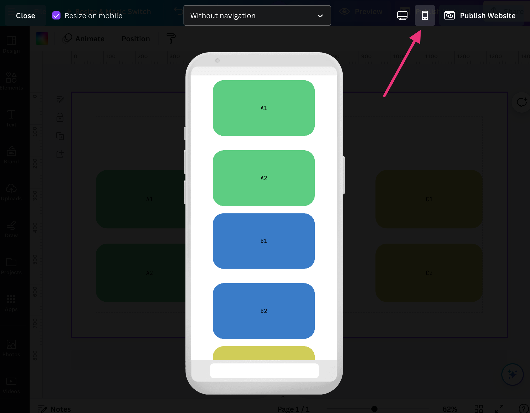
In the image below, see how A1, B1, and C1 appear in order after grouping.
Before
Grouping
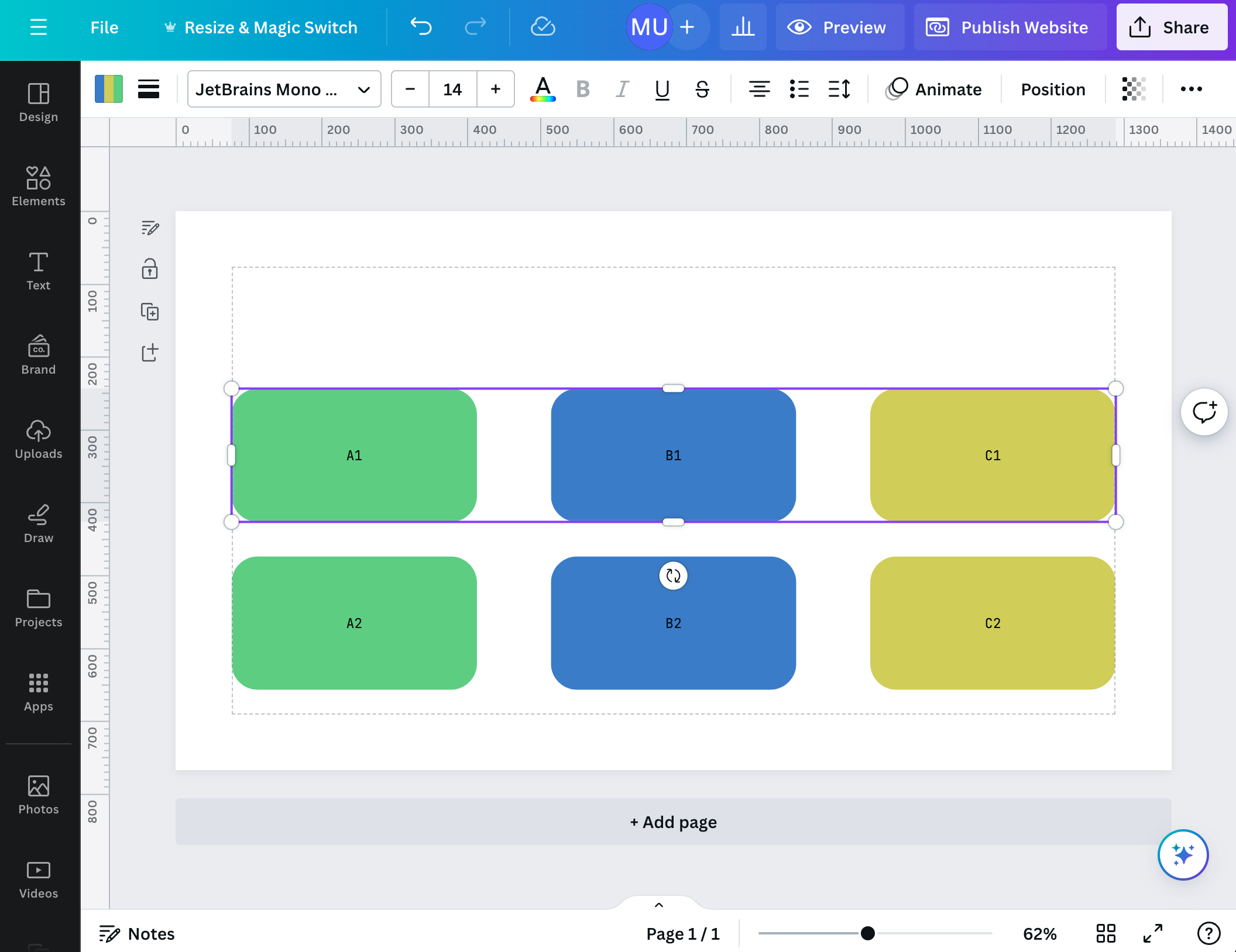
After
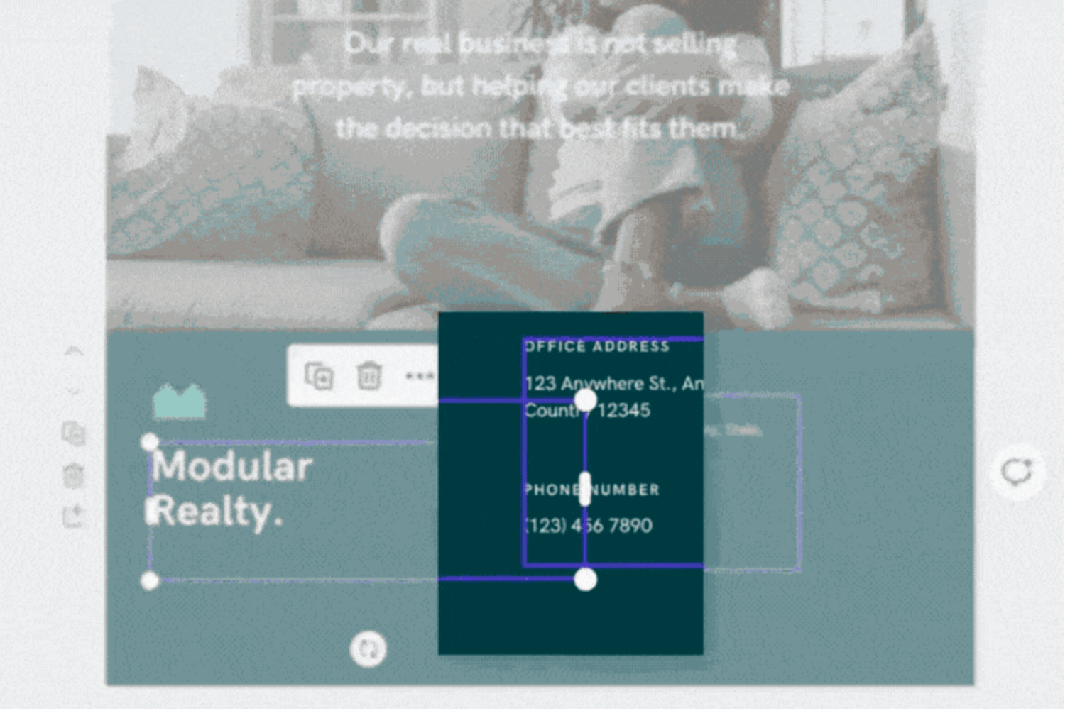
4. Look for Hidden and Overlapping Elements
Sometimes elements are hidden or overlapping, which can cause your design to look different on mobile. Make sure the borders of elements are not touching each other.
A best practice is to make the boundaries of an element only as large as necessary. Reduce any extra boundaries. This will also make it easier to drag elements around. Overlapping elements can make selecting difficult, as one may inadvertently select another element.
This is especially true for text boxes.
5. Ask for Help
If you are still having trouble, contact our highly responsive customer support. We are here to help you make your design look great on any device.