What Color Attracts the Most Attention in Advertising & Ecommerce
 Abdullah Shahid
 Psychology of colors might sound tricky at first. You might think this would be too difficult to implement, too time-consuming, or you don’t have the creative ability to think about colors properly. This article will help in giving you perspective on what color attracts the most attention in advertising and ecommerce.
The Power of Color in Ecommerce & Advertising
You might focus too much on creating the perfect ad campaign, building a responsive store, and aligning your policies with legal systems, but in the end, the psychological emotions that make the user click in 95% of the cases is the color psychology. Color is a powerful tool in marketing and e-commerce. It can evoke emotions, influence perceptions, and drive actions. Understanding the psychology of colors can give your business an edge.
In e-commerce store design and advertising, including videos and images, the right colors can capture attention and guide customer behavior. Different colors can trigger different responses: red can create a sense of urgency, blue can instill trust, and green can promote relaxation and health. By strategically using color psychology, you can enhance your brand’s appeal, improve user experience, and ultimately increase conversions.
How Each Color Influences Customers in Advertising & Ecommerce
Red: The Attention-Grabber
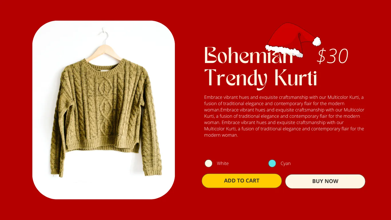
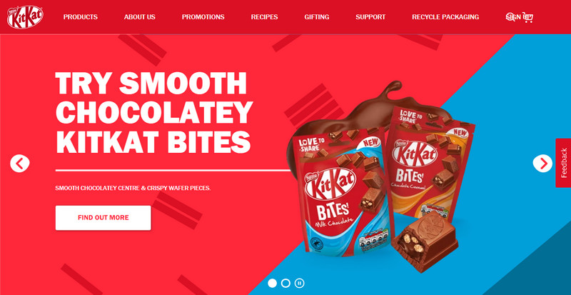
Red is one of the most attention-grabbing colors. It signifies urgency and excitement. This is why it’s often used in clearance sales or to highlight special offers. Red can create a sense of urgency, making customers more likely to act quickly.
Check out these 20 famous websites with red themes.
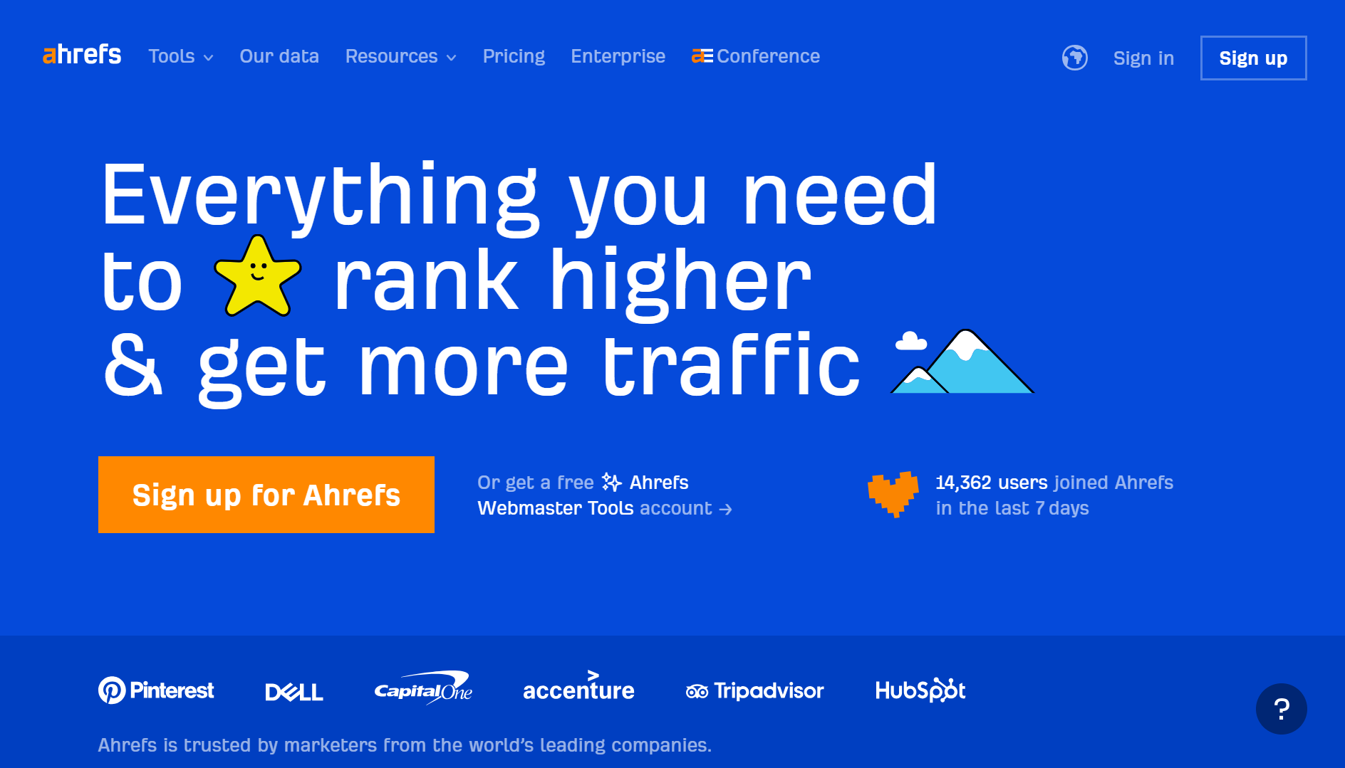
Blue: Trust and Security
Blue is a color associated with trust and security. It’s commonly used by financial institutions and tech companies. In e-commerce, blue can make customers feel safe and confident about their purchase. It’s also a calming color, which can help reduce the anxiety of online shopping.
Best website examples with blue color scheme
Yellow: Optimism and Warmth
Yellow evokes feelings of happiness and warmth. It’s a cheerful color that can grab attention without being too overpowering. Yellow is great for drawing in customers and making them feel welcome. However, use it sparingly, as too much yellow can cause anxiety.
Green: Health and Tranquility
Green is associated with health, tranquility, and nature. It’s often used in industries related to wellness and sustainability. Green can make customers feel relaxed and at ease. It’s also linked with wealth and prosperity, making it a good choice for calls-to-action related to savings.
Examples of famous websites with green color psychology.
Black: Sophistication and Luxury
Black exudes sophistication and luxury. It’s sleek and powerful, often used in high-end product marketing. Black can add a sense of exclusivity and elegance to your brand. It’s perfect for luxury items or to give a premium feel to your store.
Famous examples of websites with black theme.

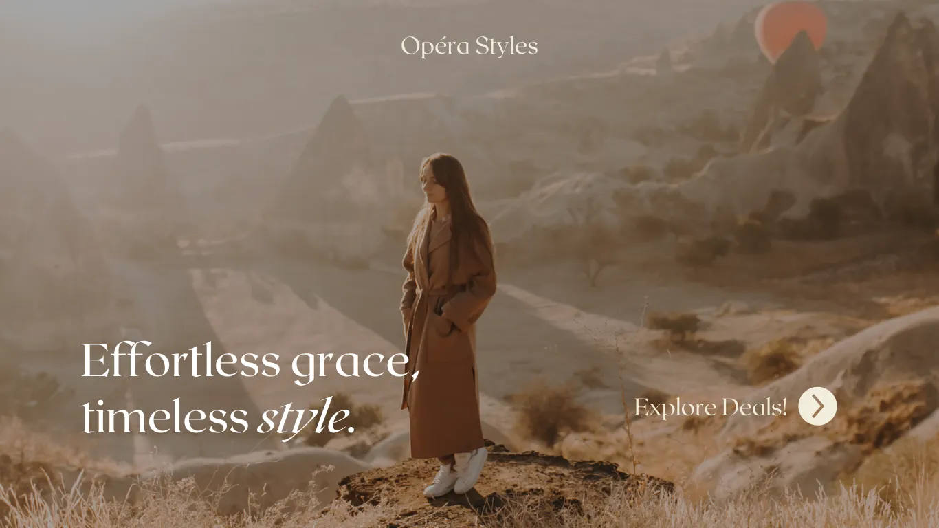
Pastel Colors: Unending Range of Calm Colors
Pastel colors, such as soft pinks, blues, and greens, evoke feelings of calmness, warmth, and serenity. These hues are often associated with springtime, renewal, and gentleness. In advertising and e-commerce, pastel colors are frequently used to create a welcoming and soothing environment. They are particularly effective in industries like fashion, beauty, and wellness, where a sense of tranquility and approachability can enhance the customer experience. Pastel colors can also help brands appear more friendly and relatable, making them an excellent choice for targeting a more relaxed and casual audience.
Examples of beautiful pastel websites
How to Choose the Right Color for Your Brand
Choosing the right color depends on your brand identity and target audience. Here are some steps to help you decide:
- Identify Your Brand Personality: Think about what your brand stands for. Is it fun and energetic, or serious and professional?
- Understand Your Audience: Who are your customers? What are their preferences and expectations?
- Test Different Colors: Use A/B testing to see which colors resonate best with your audience.
- Consider Cultural Differences: Colors can have different meanings in different cultures. Make sure your color choices align with your target market.
Less is More: Minimal is The Ongoing Trend
While color is powerful, overusing it can overwhelm your audience. Instead, use your primary color as an accent alongside a neutral or pastel base. For instance, using blue sparingly for buttons and the navigation bar, while keeping the base white or off-white, highlights important elements and maintains a clean look. This minimalistic approach aligns with current design trends, emphasizing simplicity and functionality. By balancing colors thoughtfully, you ensure your website is visually appealing and easy to navigate, enhancing the overall user experience.
Implementing Color Psychology in E-commerce
Using color psychology in your e-commerce store can improve user experience and increase conversions. Here’s how you can do it:
1. Highlight Calls-to-Action
To draw attention to your calls-to-action (CTAs), use contrasting colors. A good contrast makes your buttons and important links stand out, prompting users to take action. For example, if your main color is blue, consider using a bright orange or yellow for your CTA buttons. The contrast will catch the user’s eye and encourage clicks.
2. Create a Visual Hierarchy
Color contrasts can help guide your visitors’ eyes through your page, creating a visual hierarchy. By strategically using different colors for headings, subheadings, and body text, you can direct attention to the most important elements first. For instance, use a darker shade for headlines and a lighter or complementary color for subheadings, ensuring the content is easy to navigate and visually appealing.
3. Match Colors to Emotions
Align your color choices with the emotions you want to evoke. Different colors can trigger specific emotional responses. For example, red can create a sense of urgency, making it ideal for sales announcements or limited-time offers. Blue, on the other hand, evokes trust and reliability, making it suitable for security-related messages or customer service information. By understanding these associations, you can choose colors that enhance the desired emotional response from your audience.
4. Maintain Brand Consistency
Consistency is key to building a strong brand identity. Use your brand colors consistently across all touchpoints, including your website, emails, social media, and advertising materials. This cohesive look reinforces your brand’s presence and makes it more recognizable to your audience. For example, if your brand colors are green and white, ensure these colors are used consistently in your logo, website design, and marketing collateral.
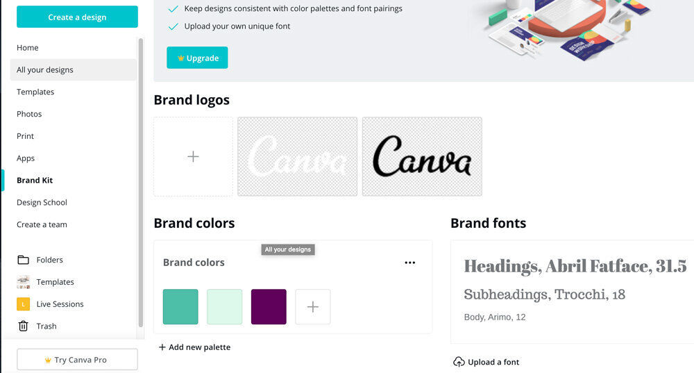
Brand Color Palette In Canva
Canva is the go-to tool for most businesses when it comes to designing ads and ecommerce landing pages. Designing great landing pages or ads in Canva is made easier with its brand palette option, ensuring your brand colors remain consistent throughout.
If you are looking to convert your Canva website into a Shopify store, you can use Canvify. This integration ensures your color strategies are executed flawlessly, maintaining brand consistency and enhancing the user experience. Canvify offers the creative freedom to experiment with colors in Canva and see what works best for your business, all while streamlining the process of bringing your designs to life on Shopify.
Conclusion
Understanding the psychology of colors can transform your e-commerce strategy. By choosing the right colors, you can attract more attention, evoke the right emotions, and drive more sales. Don’t be afraid to experiment and find what works best for your brand.