Eye-Catching Background and Text Color Combinations for Ecommerce Website | Website Color Schemes
 Abdullah Shahid
 Your clueless self is gathering website color scheme ideas again? We’ve all been there. We want our ecommerce website color palette to be pitch perfect. After all, creating an attractive and user-friendly ecommerce website involves more than just great products. The color scheme you choose can significantly impact your site’s success. Luckily, this would be the last article you need to read. We will guide you on how to decide the most eye-catching color combinations for background and text so you can decide what’s best for you.
Importance of an Ecommerce Color Palette
Your ecommerce color palette is crucial. It can evoke emotions, influence decisions, and build brand identity. Understanding the psychology of colors can help you create an appealing and cohesive look.
If you want to learn about color psychology first, read our blog on what colors are most attractive for websites.
Best Color Schemes for Your Ecommerce Website
When designing your ecommerce store, decide what type of color scheme you want to apply to your website:
Monochromatic Schemes
Monochromatic color schemes involve using various shades, tints, and tones of a single color to create a sophisticated and cohesive look. This approach can simplify design choices and provide a visually pleasing and harmonious appearance. For example, different shades of blue can convey trust, professionalism, and calmness, making it a popular choice for businesses in finance, healthcare, and technology.
By using lighter and darker variations of blue for backgrounds, text, and accents, you can add depth and interest to your website without overwhelming the viewer. Monochromatic schemes are also highly adaptable and can be used to highlight specific elements or create a clean, minimalist design.
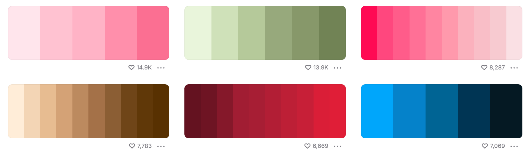 Find monochromatic color palettes
Analogous Schemes
Analogous color schemes use colors that are next to each other on the color wheel. For example, combining blue, green, and teal can create a harmonious and pleasing aesthetic.
 Image taken from Coschedule.com
Complementary Schemes
Complementary colors are opposite each other on the color wheel. Combining them can create a vibrant and dynamic look. For example, pairing blue with orange can make your CTAs stand out.
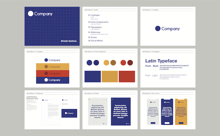 Image taken from Elementor.com
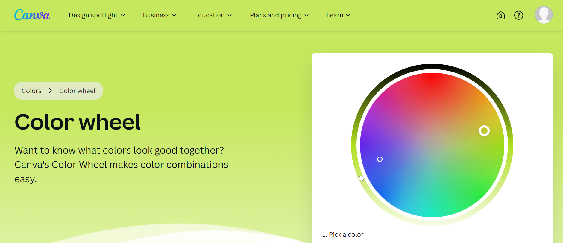
Use Canva’s Color Wheel for Simulating Color Schemes
Go to the Canva color wheel and test all possible color schemes you’d like. It’s fun playing with colors.
Beautiful Background and Text Color Combinations
Selecting the right web color combinations for background and text is essential for readability and user experience. Here are some combinations that work well:
Dark Text on Light Background
This is the most common and effective combination. Black or dark gray text on a white or light background ensures readability and a clean look.
Light Text on Dark Background
Using white or light gray text on a dark background can create a striking and modern look. This combination is often used for headers or sections that need to stand out.
Website Color Schemes for Different Industries
In our other article about beautiful colors for ecommerce, we discuss which colors are best suited for which industries. Here are some recommendations:
Fashion and Apparel
Use bold and trendy colors like black, gold, and red to create a luxurious and stylish look.
Health and Wellness
Soft and soothing colors like green, blue, and white can convey a sense of calm and trust.
Tech and Gadgets
Cool and modern colors like blue, gray, and black can convey innovation and reliability.
Best Color Contrasts for Products
Here’s how to make your products stand out. A light background like white or pastel shades makes darker products, such as black or navy, pop. This setup ensures that every detail is visible and stands out.
Conversely, a dark background like black or deep blue highlights lighter products. This contrast is ideal for items with delicate details or vibrant colors.
Neutral backgrounds such as beige or gray work well with vibrant products like bright red or electric blue, making the products the centerpiece.
Using complementary colors, such as blue and orange, creates a bold effect that draws attention.
Additionally, using accent colors to highlight specific product features can be effective. For instance, a dark gray background with silver products can have small red accents to highlight buttons or key features.
To implement these strategies effectively, maintain strong contrast for clear product details, A/B test different contrasts to see what resonates with your audience, and maintain consistency with your brand color palette for a cohesive look.
Additional Tips for Effective Website Color Schemes
Here are some additional tips to enhance your website color schemes:
Highlight Calls-to-Action
Use contrasting colors for your CTAs to make them stand out. For example, a bright orange button on a deep blue background can be very effective (depending on the industry but you get the point).
Maintain Brand Consistency
Ensure that your color scheme aligns with your brand identity. Use your brand colors consistently across all touchpoints. Define a color palette and font styles before you design your store.
Don’t Overdo It
While colors are important, don’t overdo it. Too many colors can overwhelm your visitors. Use your primary color as an accent alongside a neutral background. For example, using blue for buttons and the nav bar while keeping the base white can create a clean and professional look.
Consider Ecommerce Landing Page Design Principles
Apart from colors, also consider what elements you should add in your landing page design like hero image, testimonials, maps etc. Read our blog to know how to create a compelling landing page for ecommerce website.
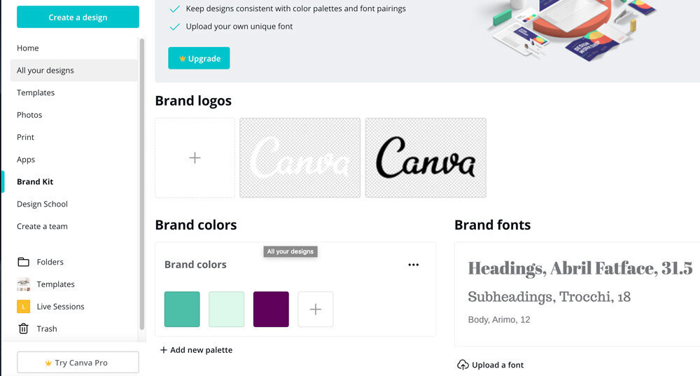
Using Canva to Create Brand Palette for Ecommerce Websites
Establish a cohesive brand color palette for your ecommerce website to maintain a consistent and professional look. Canva offers an easy-to-use brand palette option that helps you design eye-catching landing pages. You can select and save your brand colors, ensuring all your designs stay true to your brand identity.
Once you’ve crafted your perfect design in Canva, importing it to Shopify is a breeze with Canvify. This tool allows you to seamlessly transfer your Canva designs to your Shopify store with just one click. By using Canvify, you maintain brand consistency and enhance the user experience, ensuring your website looks polished and professional.
Conclusion
Choosing the right background and text color combinations is essential for creating an engaging ecommerce website. By understanding the psychology of colors and what makes an effective color scheme, you can decide the best color ones for your ecommerce website.