Design Tips For Cyber Monday Website Landing Page
 Abdullah Shahid
 Cyber Monday has grown to be a significant occasion for internet merchants, drawing customers searching for special offers and generating enormous sales. For a company, a well-designed landing page for Cyber Monday might be the difference between losing potential clients and having excellent conversion rates. Here are some helpful website design pointers to help you get the most out of your Cyber Monday landing page.
What Websites Participate in Cyber Monday
Cyber Monday is no longer limited to well-known companies like Amazon and Walmart. It is observed by nearly all kinds of businesses that have an internet presence. These range from little, independent online retailers to massive platforms selling anything from digital services to apparel, home goods, and tech devices.
Consider the kinds of businesses that participate in Cyber Monday while creating your landing page. Retailers that offer toys, apparel, electronics, and cosmetics—categories that perform well year after year—are frequent participants. Niche market websites can also use Cyber Monday to target their devoted clientele with special discounts and incentives.
Read more about best marketing ideas for Black Friday and Cyber Monday.
Why Cyber Monday Has Huge Significance
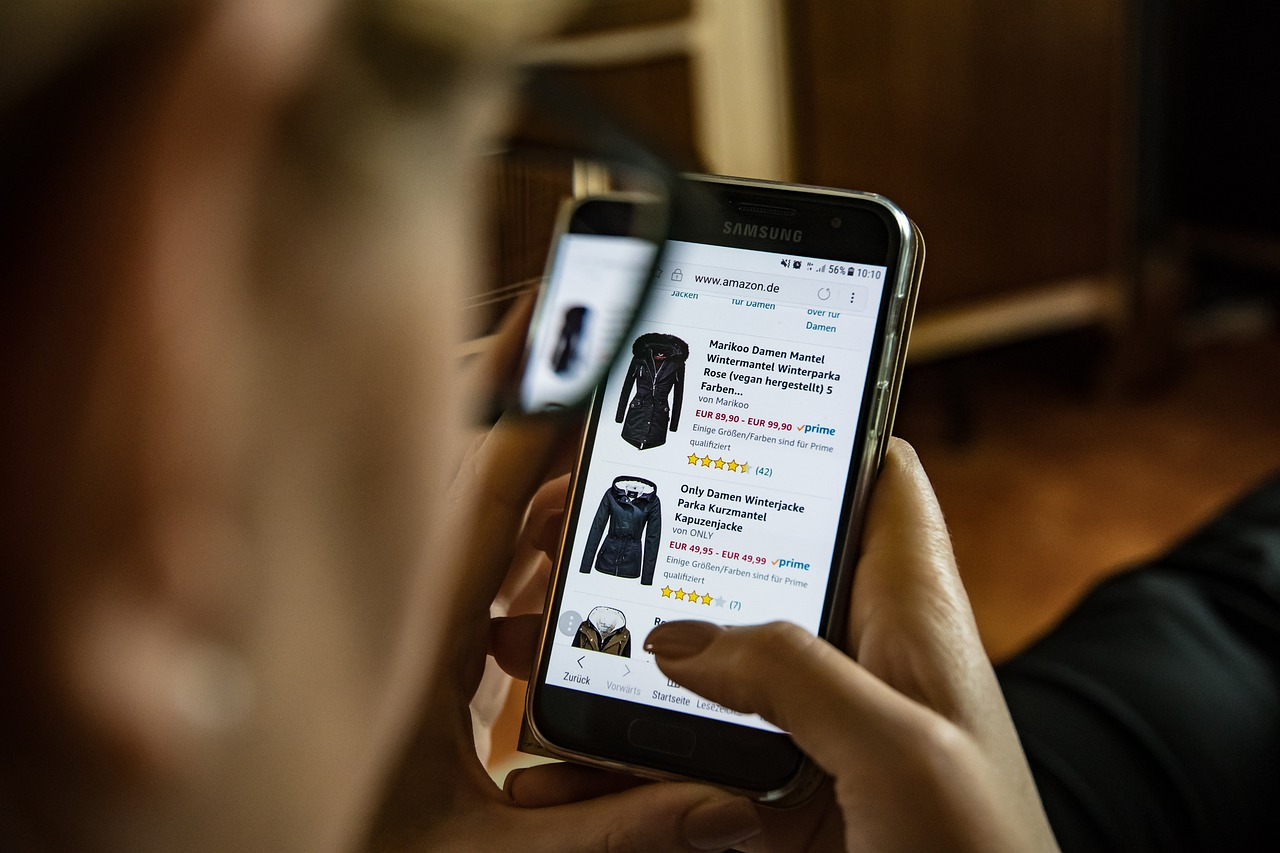
The importance of Cyber Monday continues to grow as more consumers shift to online shopping, especially via mobile devices. For instance, in 2022, nearly 50% of Cyber Week sales were made on smartphones. Cyber Monday’s appeal lies in the convenience and exclusive deals that online shopping offers, making it one of the biggest days for eCommerce in the year.
Moreover, Black Friday sales can also be found in physical stores, while Cyber Monday is completely an online shopping event. Contrary to what its name suggests, Cyber Monday includes all product categories—not just electronics.
Cyber Monday Website Design Tips To Increase Conversions

A well-designed Cyber Monday landing page can significantly boost your conversion rates. The landing page should quickly convert the visitor, as this is a limited-time event.
Create a Sense of Urgency
The main goal of Cyber Monday is to create urgency. Using countdown clocks to show when an offer expires or how long customers have to take advantage of a deal helps create a sense of scarcity. Phrases like “only X items left” or “limited-time offer” encourage guests to act fast.
Mobile-Responsive Design
With 50% of Cyber Monday sales coming from mobile devices, ensure that your landing page is optimized for mobile. The design should look fantastic on all screen sizes, with buttons and offers easily accessible on smartphones and tablets.
Learn more about optimizing your Shopify website for mobile using Canva.
Use High-Quality Images and Videos
High-quality visuals are essential for grabbing attention. Use professional images to present your products and consider adding brief, engaging videos to demonstrate product value. Ensure these media assets load quickly to avoid slow page speeds.
You can avoid speed issues by embedding videos in your website landing page.
Optimize for Speed
Slow-loading pages can cause potential buyers to leave your site. Use tools like Google PageSpeed Insights to test performance, and optimize your landing page by reducing design size, removing unnecessary scripts, and compressing images.
Include Clear and Multiple CTAs
Guide visitors toward a purchase by using multiple prominent CTAs (Call-to-Action buttons). Make them stand out with contrasting colors and place them above and below the page fold.
Read more about Cyber Monday marketing ideas and slogans.
Highlight Discounts and Offers
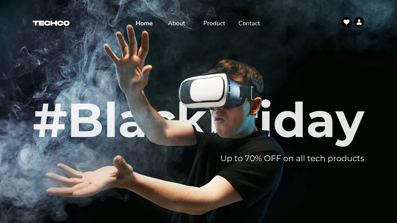
Ensure that the discounts and promotions are instantly visible. Use bold typography and a color scheme that highlights the exclusive deals while reflecting your brand identity. Banners like “free shipping” or “percent-off” can entice visitors to make a purchase.
Design Cyber Monday Shopify Landing Page in Canva
Find free editable Cyber Monday website landing page templates for Ecommerce!
If you need a Shopify landing page quickly for Cyber Monday, Canvify simplifies the process. Canva eCommerce templates make it simple to create visually appealing landing pages without the need for complex coding or web design expertise. Canvify seamlessly integrates with Shopify in a matter of seconds, enabling you to convert your Canva design into a fully functional Shopify page. Whether you’re selling athletics, electronics, or skincare products, Canvify gives you access to Cyber Monday-themed themes. This makes your design work easier and allows you to concentrate more on giving your clients outstanding offers. Simply select a template, edit it, and upload it directly to Shopify to expedite and improve the efficiency of your Cyber Monday planning.
These landing pages are optimized for high conversions, perfect for the Cyber Monday rush. Learn more about importing Canva pages into Shopify.
Conclusion
To capitalize on Cyber Monday’s sales potential, your website needs to be fast, visually appealing, and easy to navigate. Use a clean design, optimized loading speed, and mobile compatibility to ensure a seamless experience for customers. Include compelling CTAs, high-quality images, and urgency-driven elements like countdown timers. By following these design tips, you can ensure that your landing page boosts Cyber Monday conversions and sales.
