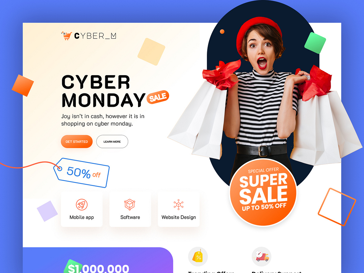
Cyber Monday Website Design Tips for Maximum Sales Conversion
Cyber Monday is the biggest online shopping day of the year, and your website is the digital storefront that will either entice visitors to buy—or send them clicking away. To stand out in the crowded marketplace, you need more than flashy banners and generic layouts. Here are some powerful tips that will elevate your Cyber Monday landing page, help boost sales conversions, and make sure you’re hitting every important detail.

Credits: Dribble
1. Emphasize Trust Signals
Cyber Monday shoppers are cautious. They’re hunting for deals but also want to know they’re spending money on trustworthy sites. Add trust signals like verified customer reviews, security badges (SSL), and money-back guarantees prominently on the page. If you offer free shipping or easy returns, display those as trust badges near the CTA. Customers are more likely to purchase if they feel secure about their decision.
Why this works: Building trust reduces customer anxiety and gives them confidence to make impulse purchases—essential on high-traffic days like Cyber Monday.
Read: 7 Ways to Add Reviews to Shopify Store
2. Optimize for Speed
Nothing kills a sale faster than a slow-loading site. Every extra second of load time costs you conversions. Use image compression, caching, and a content delivery network (CDN) to ensure your Cyber Monday landing page loads instantly, even under heavy traffic.
Pro Tip: Test your load times in advance with tools like Google PageSpeed Insights. If your page takes more than 3 seconds to load, you’re at risk of losing impatient shoppers.
How to Optimize Your Canva Designs for Mobile Phones?
3. Leverage Urgency with Countdown Timers
Urgency is a tried-and-true sales tactic, but it needs to be subtle. Adding a countdown timer to highlight limited-time offers can drive faster decisions. Place it near your top deals or as a banner across the landing page.
Why this works: Shoppers are more likely to complete purchases when they feel a deadline looming. It adds urgency without feeling pushy.
4. Feature Mobile-Friendly Design
Nearly half of all Cyber Monday sales happen on mobile. Make sure your page is fully responsive. Test every element, from navigation menus to product images, to ensure it looks flawless and functions smoothly on mobile devices.
Hidden Trick: Consider using sticky CTAs on mobile, so shoppers can click “Buy Now” or “Add to Cart” without scrolling back up. Canvify makes this easy by offering mobile-optimized templates that guarantee smooth functionality across all devices.
5. Focus on Visual Hierarchy
Your landing page should guide the visitor’s eye in a way that directs them to your most important offers. Use bold headlines, vibrant CTA buttons, and contrasting colors to create a visual hierarchy that prioritizes top-selling products or time-sensitive offers.
Design Tip: Stick to a clean design where your CTAs stand out. Busy, cluttered pages can overwhelm customers and reduce conversion rates. Check out our blog on landing page templates for Cyber Monday, where we share pre-built designs that can help create a clear, effective layout in no time.
6. Showcase Social Proof in Strategic Areas
Place testimonials, product reviews, or even live sales notifications (e.g., “John just bought this item!”) near your product descriptions and CTAs. Authentic reviews from real customers give hesitant buyers the nudge they need to make a purchase.
Why this works: Humans are naturally influenced by others’ behavior. Seeing others buy makes new customers feel like they are making the right decision.
7. Create a Seamless Checkout Experience
Your checkout process should be as frictionless as possible. Minimize the steps required to complete a purchase. Offer guest checkout options, multiple payment methods, and auto-filled shipping details where possible.
Pro Tip: Avoid surprise costs like extra shipping fees at checkout—this is one of the top reasons for cart abandonment. Be transparent about all costs upfront.
You know what? You can also add ‘Buy Now’ or ‘Add to Cart’ links of your Shopify store products directly on social media. So when someone clicks the shop now button, the product is right in their cart and they are at the checkout page.
8. Use Personalized Recommendations
Implement a recommendation engine on your Cyber Monday page to offer personalized product suggestions based on browsing history or past purchases. “Frequently bought together” sections or “You may also like” recommendations are great for increasing the average order value.
Hidden Advantage: Canvify’s templates support integrations that allow for dynamic content placement, so you can showcase recommendations tailored to each user’s preferences.
9. Eye-Catching Cyber Monday Slogans & Puns
Don’t underestimate the power of a witty slogan. Clever, well-placed copy can engage visitors while highlighting your deals. Use humor sparingly but effectively, like in your headers or product descriptions. For more ideas, check out our list of Cyber Monday slogans and puns in our related blog post.
10. Integrate Canvify for Effortless Shopify Page Design
If you’re running a Shopify store, creating an appealing Cyber Monday landing page can be a breeze with Canvify. You can easily design stunning, customized Shopify pages directly in Canva and export them in just one click using the Canvify app. It saves you time, effort, and the need for a developer, so you can focus on what matters most—making sales.
Find free editable Cyber Monday website landing page templates for Ecommerce!
Conclusion
By using these tips, you’ll craft a Cyber Monday landing page that not only looks great but also converts visitors into buyers. And if you’re looking for pre-made templates to give your Cyber Monday landing page an extra boost, stay tuned for our upcoming blog where we’ll dive deep into Cyber Monday landing page templates.
Happy selling!
