Elements of Building a Compelling Shopify Landing Page
 Abdullah Shahid
 There are two types of ecommerce businesses: those who spend all their resources making their storefront look good and ignore other aspects of the business, and those who focus on refining their product while neglecting the store’s appearance. As responsible members of the ecommerce space, we have mutual disdain for both (pun intended). We offer a middle path to optimize your landing page for conversions without excessive resources and effort. A well-designed landing page is crucial for your Shopify store. This blog explores essential elements that make a landing page compelling and effective.
Elements of a High Converting Shopify Website
A landing page is more than animations and images. It should clearly reflect your brand message. What are your core values? Communicate them through the landing page. What follows is a checklist for planning a landing page for your Shopify ecommerce store.
Brand Color Palette
Don’t just choose any colors. Spend a few minutes researching the best color palette for your brand aesthetics. If you’re too lazy, ask ChatGPT or read our article on best color combinations for ecommerce stores.
Your brand’s color palette plays a vital role in attracting and retaining customers. Colors evoke emotions and create a connection with your audience. Choose colors that reflect your brand’s identity and appeal to your target audience. For example, use a combination of vibrant and neutral tones to create a balanced and attractive look. Stick to a limited color scheme to maintain consistency.

Have a Catchy Hero Banner
The hero banner is the first thing visitors see on your landing page. It should be visually striking and relevant to your brand. If you visit most ecommerce sites, they have very dull hero banners. Brainstorm a catchy copy that resonates with your brand. This helps a lot moving forward. When a customer browses products, their brain subconsciously compares the tagline to your products. Delivering a consistent vibe is crucial. This leads us to the next step of a compelling landing page.

Clear Brand Messaging
Consistent and clear messaging is essential for conveying your brand’s unique value proposition. Your messaging should be simple, direct, and aligned with your brand’s voice. Most importantly, your brand message should be consistent across the store. Use the same color palette and the same story (repurposed for each product). Stories sell harder than products ever can. Highlight what sets you apart from competitors (but in a very elegant way).
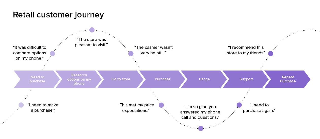
Define a Customer Journey Map
Creating a customer journey map is crucial for an e-commerce store owner as it helps to strategically design the visitor’s path from the moment they land on your page to the point of conversion.
For example, if the customer begins on the landing page, the hero banner should catch their attention. Next, decide if they should go directly to the product section or if they should scroll down to learn more about your brand and offerings first (in that case, don’t add product page buttons on top). This decision can be guided by A/B testing to see which approach results in higher engagement and conversions.
After the HERO banner, consider adding a section that highlights your unique value propositions and features. Follow this with a detailed product showcase that entices visitors with your best offerings. Then, integrate social proof, such as customer testimonials and reviews, to build trust and credibility.
Ensure that each section naturally leads to the next, keeping the visitor engaged. Use clear and compelling CTAs strategically placed to guide visitors towards making a purchase or taking another desired action. Additionally, optimize the journey for mobile users to ensure a seamless experience across all devices.
Add Social Media Feed
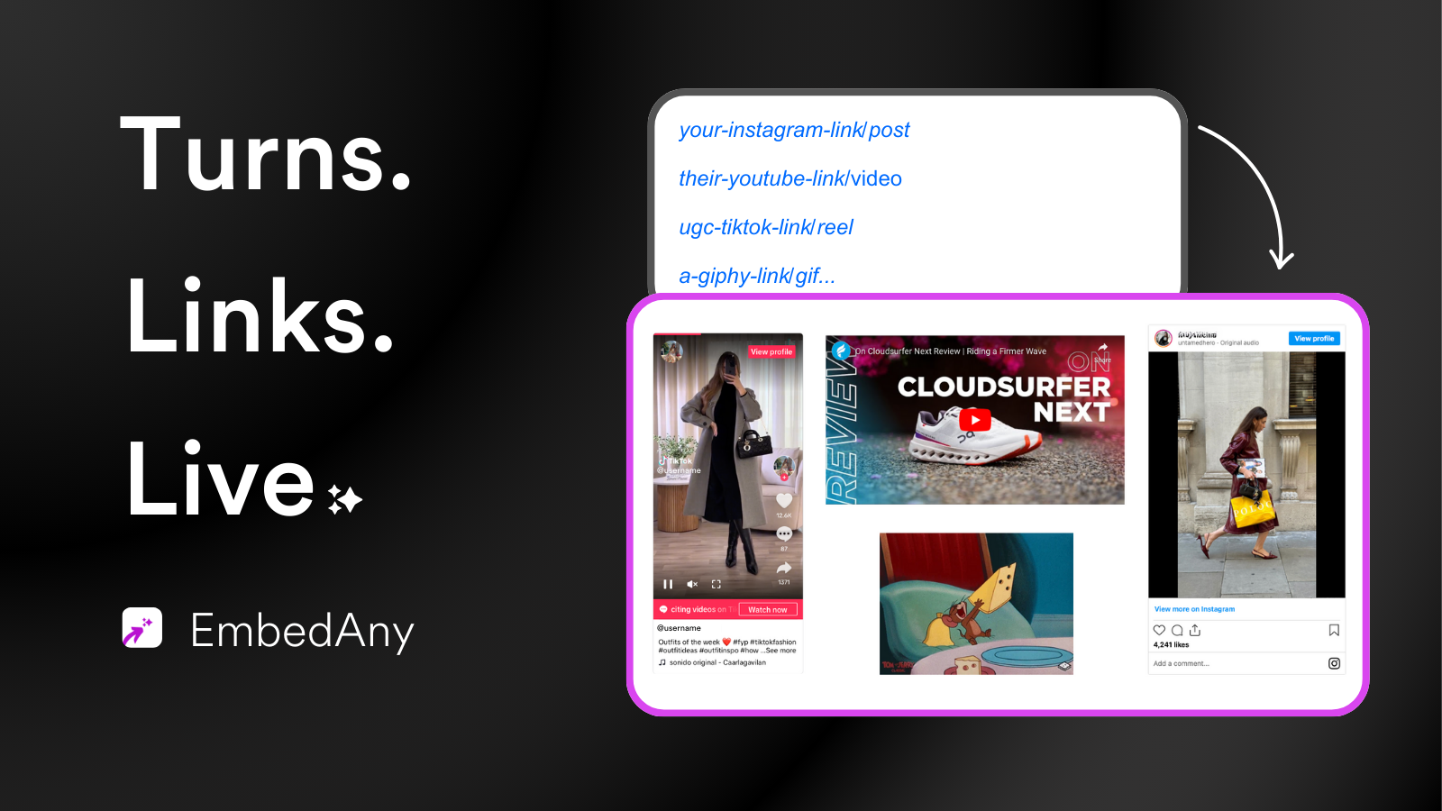
Integrating social media feeds on your landing page builds trust and engagement. It shows real-time updates and interactions with your audience. Use tools and plugins to add social media feeds to your Shopify store (Add Live TikTok Video in Canva Design). For example, display your Instagram feed to showcase user-generated content and customer reviews.
EmbedAny is a cost-effective solution for embedding feeds from over 800 platforms like Instagram, TikTok, and YouTube. It simplifies adding dynamic, real-time content to your site without multiple apps or high subscription fees.
Pros:
- Affordable and supports 800+ platforms.
- Easy setup, no coding required.
- Automatic feed updates.
Add Interactive Maps if Needed
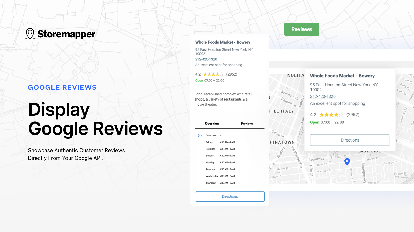
Interactive maps enhance the user experience, especially for local businesses. They help visitors find your physical location easily. Integrate maps using tools like StoreMapper for Shopify. For example, a café could add a map showing its location, nearby attractions, and directions. You can get navigation to the location and other information and insights through Shopify Apps like StoreMapper.
Never Ignore Mobile Optimization
Mobile optimization is crucial as more people shop on their phones. Ensure your landing page is mobile-friendly. Use responsive design to adapt to different screen sizes. For example, simplify navigation, optimize images, and make CTAs easily tappable. Tools like Google Mobile-Friendly Test can help you check and improve your mobile optimization.
If you create your Shopify stores directly through Canva, your website is already mobile optimized. Learn more about creating Shopify stores in Canva here.
Strategic CTAs
Call-to-Actions (CTAs) drive conversions by guiding visitors to take specific actions. Create compelling and strategically placed CTAs throughout your landing page. As explained in the last element, CTAs must only be placed where you want action. If you think users won’t be prompted to browse products yet, don’t add a CTA. Make them stand out with contrasting colors and clear, concise text.
Use High-Quality Visuals & Animations
High-quality visuals and animations increase user engagement and convey your brand’s story. Use visuals that highlight your products and tell a compelling story. For example, a beauty brand could feature a video tutorial on how to use its products. Ensure visuals are optimized for fast loading and mobile viewing.
Read this article on the best way to incorporate animations, visuals, and other elements to your store.
Incorporate Trust Signals
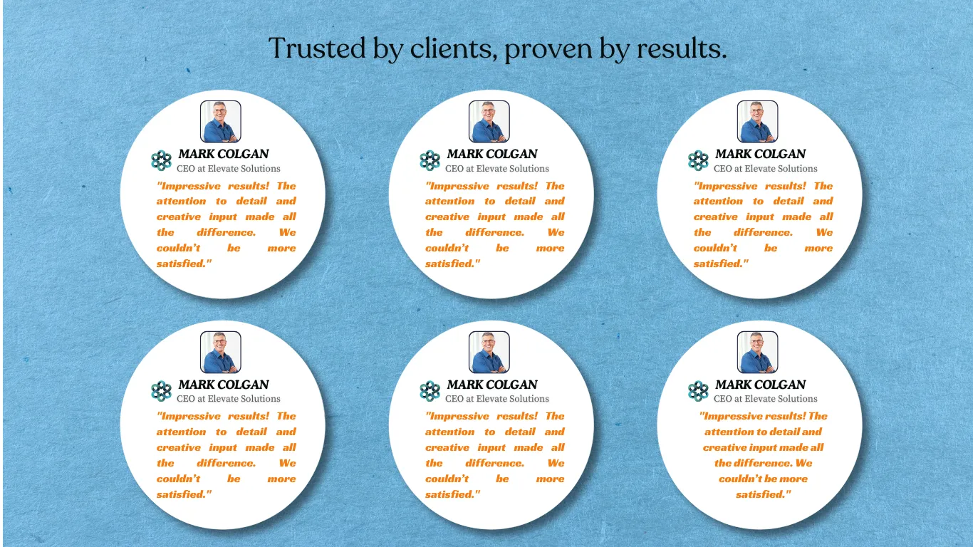
Trust signals like reviews, testimonials, and badges build credibility and trust with new visitors. Display customer reviews and ratings prominently on your landing page. For example, add a section with testimonials from satisfied customers or badges from reputable organizations. Highlight your return policy and customer support to reassure visitors.
Check Shopify’s 20 examples of great landing pages for ecommerce.
Create High Converting Shopify Landing Pages in Canva
Canvify makes creating a compelling Shopify landing page effortless. Design your entire landing page in Canva, including hero banners, product showcases, and CTAs. With Canvify, you can import your complete design into Shopify with a single click. This ensures that your visually stunning and strategically planned pages are seamlessly transferred to your online store without any coding. By using Canvify, you can focus on perfecting your design in Canva, knowing it will look just as impressive on your Shopify site.
Conclusion
A compelling Shopify landing page combines several key elements: a strong brand color palette, a catchy hero banner, clear messaging, a customer journey map, social media integration, interactive maps, mobile optimization, strategic CTAs, high-quality visuals, trust signals, and optimized load times. Continuously test and refine your page to achieve the best results. Implement these tips to create a landing page that engages visitors and drives conversions. Share your success stories or ask for help on our email.
